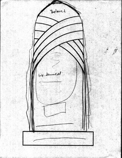


We decided that rather than cutting out the top (which also turned out to be expensive),
we'd draw it to a peak pointing upwards, trying to emphasize grace and verticality again.
Then, we started laying out what words we wanted and where they would go...


